What a fuck up. What’s wrong with a standard default timeline of stories… I shouldn’t be pushed lifestyle and opinion pieces in my news feed. Not everything needs an account, especially not the public broadcaster.
deleted by creator
You can customise the app’s feed without an account. I’m not sure about the website.
On mobile I get (almost) 3 lines of 1 story. lol
I hate it. Really hard to skim read.
This misalignment is also shitting me to tears.
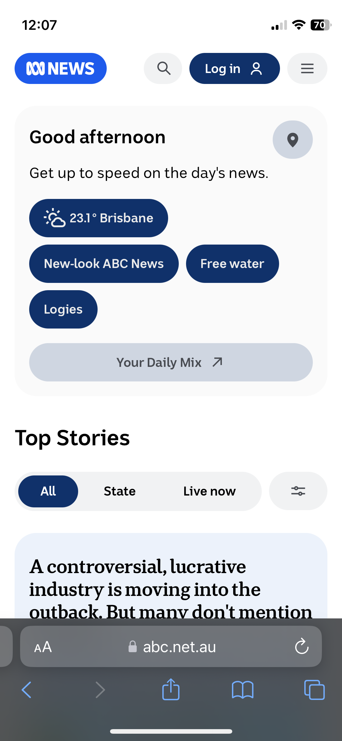
hate it. I’ll admit I dont love change, but the amount of dead space and the space utlization vs information conveyed ratio is WAAAAAY off where it needs to be to be taken seriously. If you share less info than news.com.au that really shoulda been a red flag in the design process.
Thank goodness, finally! I’ve always thought the most pressing issue with the ABC was its website design! … or not. Did anyone actually ask for this? :-\
I find it harder to read as there’s no separation between content and menus, and there’s a heap of wasted whitespace… which seems to be the norm for every website these days. Who needs content? Empty pixels download faster. Or something.
I miss the old internet where content was king, and design a barely considered afterthought.
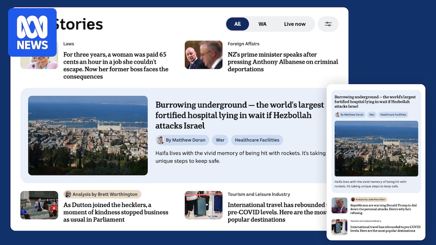
Not keen at all on how it increases picture sizes and makes certain articles more prominent at the expense of actual information.
Also, what pelican told them that video shorts should take up such a massive section of the page (and not at the bottom either)? One of my bugbears these days is how information that can be conveyed much faster as text keeps getting pushed as video so people can spend both more time and vastly more data to find it out.
I don’t like it but we’ll probably get used to it. Is there a Dark mode for the update? All Tue white space makes the new version especially bright
Went to look expecting to hate it … while there are probably some bugs to be ironed out I think it’s nice and in a side-by-side I’d probably prefer the new one by a decent margin … it seems cleaner and easier for my eye to move around looking for what I’m interested in.
Too many round corners and watching it this morning they’ve made a mess of their on screen graphics. There’s a weird space in the bottom right and crappy orange gradients make it look like commercial tv… Was that the point?
Apart from the blue icon now, the app seems the same to me.Nevermind…
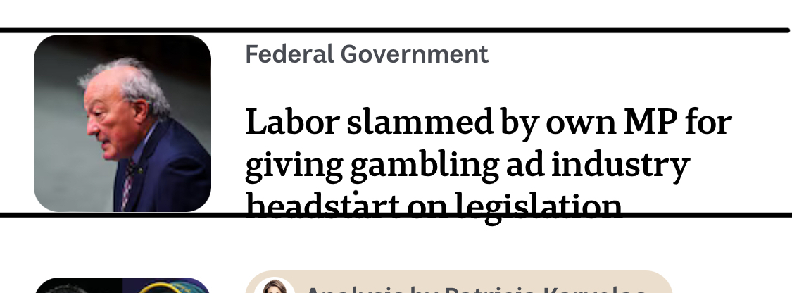
The ABC NEWS app will also get these new features, with some readers seeing the new experience from today. All ABC News app users will see the new features in the coming months.
I am indifferent to the redesign but the application does appear to be a lot faster for me. Though it’s not mentioned in this article, I believe this was one of the areas they were looking to address recently.
The updated tv news music was jarring. I’d never noticed the previous one, but the new one sounds like the old one but pop-musiced a bit? I don’t know how to describe it, but it’s not better.