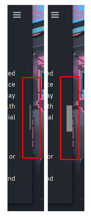
Tl;Dr:
In about:config, I changed these preferences:
- widget.non-native-theme.gtk.scrollbar.round-thumb: false - This makes the scrollbar not have rounded edges
- widget.non-native-theme.gtk.scrollbar.thumb-size: 1 - This makes the scrollbar ‘chonkier’ within the scrollbar region
- widget.non-native-theme.scrollbar.size.override: 20 - This increases the scrollbar region size. Larger number = wider scrollbar
- Make sure widget.gtk.overlay-scrollbars.enabled is set to false - This should have been set to false when you enabled “Always show scrollbars”
On Windows, Firefox follows the system setting (System Settings > Accessibility > Visual Effects > Always show scrollbars).
With mouse wheels and touch screens everywhere, I can’t even remember the last time I wanted to drag a scroll bar. Even worse, I have faint memories of infinitely scrolling websites that just hated it when you dragged the scroll bar. What do you need that interaction for? I’m not judging, I’m just curious about the use case.
I seldom care to manually interact with it, but by god do I hate when it’s so narrow, low-contrast, and auto-hiding as to be virtually invisible (and I’m not even visually impaired!).
I want to know where I am, and how long the document is. Why are modern GUIs trying so hard to hide this information from me while pretending they aren’t, like a child stubbornly avoiding eye contact when the teacher asks a question?
Genuine question. Who still uses a scrollbar for more than a visual indicator of progress?
Pretty much never for me except when I remote in to MacOS machines for some reason Shift + Mouse Wheel doesn’t scroll horizontally. So I have to tap a left or right arrow key and then drag the bar.


