

Hi,
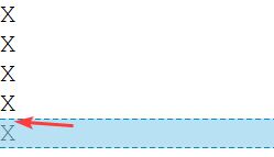
No matter what I try
<style>
.FlexColumn {display: flex;flex-flow: column nowrap }
</style>

<div class="FlexColumn">
	<div>X</div>
	<div>X</div>
	<div>X</div>
	<div>X</div>
	<div>X</div>
</div>
<!-- I tried many CSS trick here... -->
<div>
   <span>X</span><br><span>X</span><br><span>X</span><br><span>X</span>
</div>
I always get a vertical gap between the characters !
Any ideas ?
Thanks.
👆 Sometimes the best solution is to just let it be. It’s better to adapt your design to fit the technology, than it is to fit the technology to your design.