
Is there a setting that might resolve the issue attached, where really long comment threads get squished into illegibility?
Interested to see what solutions for this are proposed that don’t involve re-rooting the comment tree from a lower depth. Tesseract is susceptible to this on mobile as well, and I’ve decreased the left padding as far as it’ll go as a partial workaround.
I’m not crazy about having to re-root the comment tree like Reddit does (or at least used to do) beyond a certain depth, so hoping to hear some better suggestions I can borrow.
I can’t think of a solution that isn’t re-rooting in one form or another. Do you know of any app that has done it differently?
Not off my head, no. Which is why I was asking if there were any other alternatives. I don’t particularly like that solution.
Edit: Since I know the depth on a per-comment basis, maybe I could reverse it in CSS beyond a certain point and have them start going right to left? (spitballing here)
How about this: as you scroll past an entire comment in the chain (the bottom of the comment leaves the top of the screen) the entire comment chain is shifted to the left?
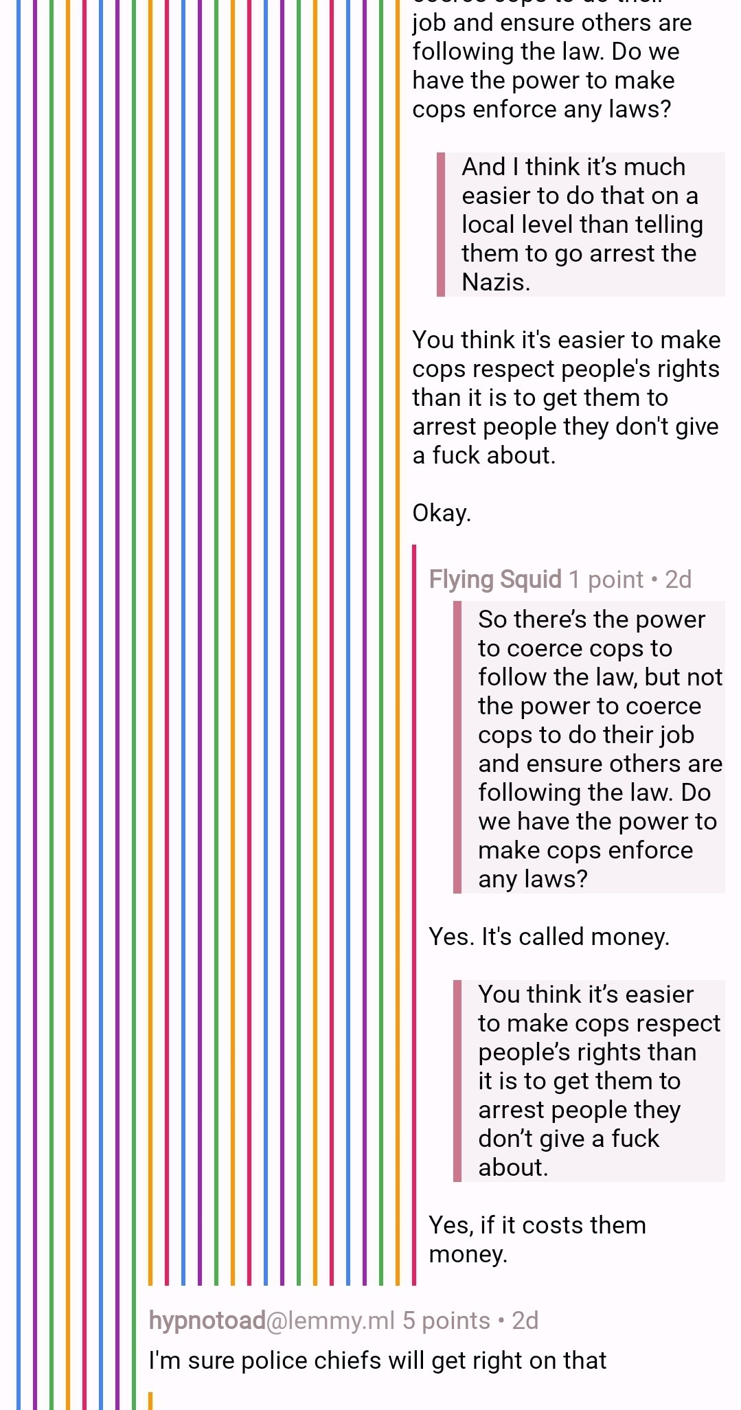
We should start a ridiculously long comment thread here so people can see how the various Lemmy apps out there handle and render things…
Lol, well, I’ll keep the ball rolling with this reply.
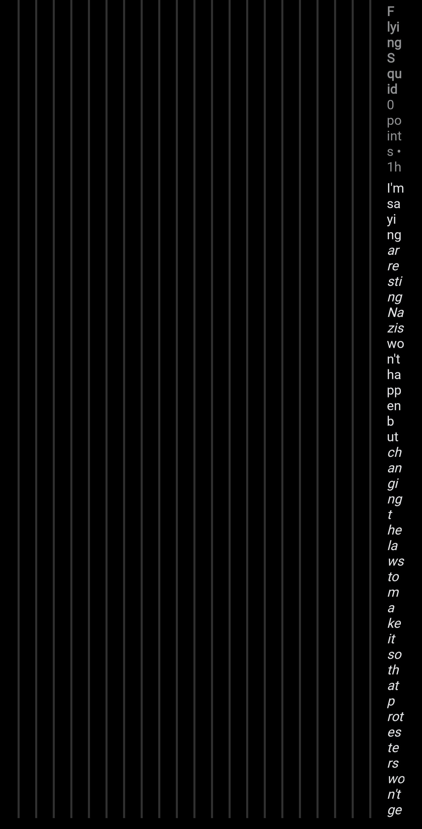
It took me a while to notice this behavior (on any client) because once a comment thread gets that deep, it’s usually a slap fight I wouldn’t bother reading anyway lol
i’m tempted to make a stupid feature where it turns into an ace attorney fight after about 15 comments of depth.
Pee is stored in the balls. Wanna fight about it?
How could I fight with the truth? Gonna need a different argument.
deleted by creator
Haven’t used Voyager for a bit, but maybe. I’ll check and see how it does it. I’m trying to avoid that as a solution, though, if I can.
I’ve always joked (but not joking lol) that if the user has to scroll horizontally, you’ve failed as a designer. 😆
Settings shortcut: Comments > Padding style
Setting this to minimum helped me
There’s a setting for everything! Amazing, thank you 💪
That helps a lot, thanks! 👍
Rotate your phone
That did help, thanks.
But in another note, when I rotated back after finishing the thread, it was worse than before, with no comment hierarchy visible at all. I had to refresh to get it back.
Here’s the last comment in the thread I was following, just in case it’s helpful.
You can try adjusting the padding size; mine is on minimum and, while it still wasn’t ideal and would have gotten cut off as well if it continued, I was able to read up to the end.
Settings shortcut: Comments > Padding style
That definitely helps, thanks
For the record, some clients (Voyager) use rainbow colors that allow the levels to be distinguished while taking up very little vertical space, or even no vertical space past level 10 or so (might get ambiguous since the colors loop every 7 or so but there are ways around that, such as rotating the hue 6 % evedy cycle)
If you go to settings, comments then style… Could this be the thing?


