

You must log in or register to comment.
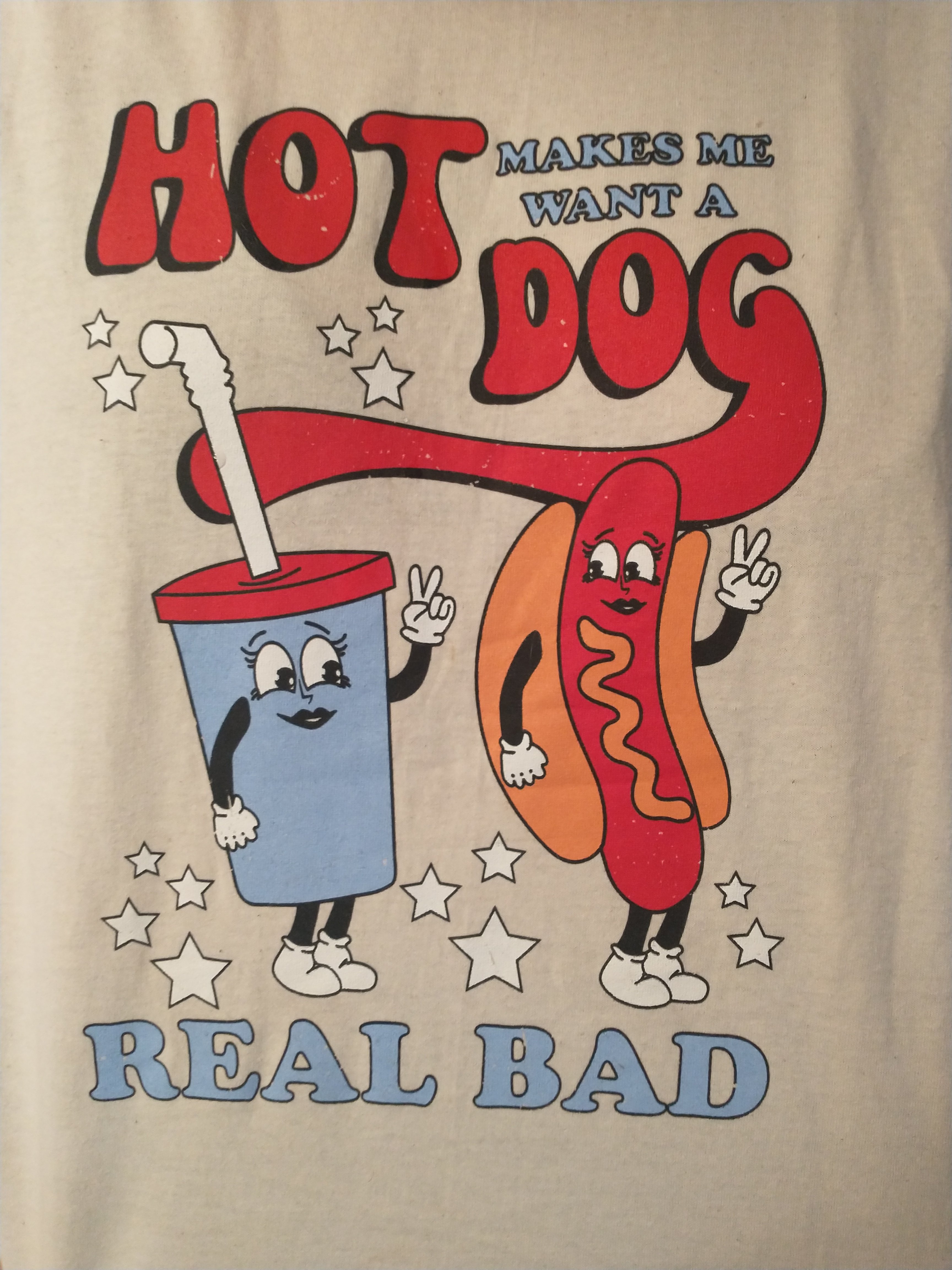
I don’t want to be pedantic because I love this community, but as a designer, it’s clear that the ad makes of multiple techniques to differentiate between “makes me want a” and “hot dog”.
- the sizes are different
- there’s a very obvious colour difference
- the font is different
- and “makes me want a” is grouped up in a corner, so the eye knows to go from one phrase to the other.
Unfortunately, the colour, size, font weight and position of “hot dog” draws the eye far more than “makes me want a”. It suggests prominence and that the reader should start with it. It therefore reads
“Hot Dog makes me want a real bad”
Which then does work for this sub…