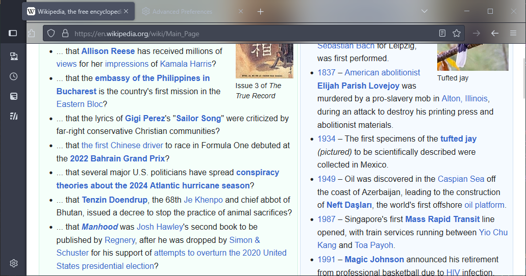
Depends on how hacky you want to get. Backdrop-filter won’t work across contexts (chrome-context vs. website context) but you can sidestep that easily by adding the blurring effect in userContent directly to the page. The obvious issue with that kind of effect in general is that you cannot then interact, or even really ever see the top part of the web page, because it’s always covered by browser chrome - that would be the case even if the blurring effect could be done across contexts. You can maybe work around that a little bit by adding a top padding to web page body like in the example below, but that is totally not guaranteed to work for all sites because sites can style themselves however they please.
super-fast and hacky userchrome:
#navigator-toolbox{
  background: rgba(0,0,0,0.3) !important;
  margin-bottom: -86px;
  z-index: 5 !important;
}
.browser-toolbar{
  background: transparent !important;
}
#sidebar-main,
#sidebar-box,
#sidebar-splitter{
  padding-top: 86px;
}
userContent.css:
@-moz-document url-prefix("http"){
  :root::before{
    content: "";
    top: 0;
    position: fixed;
    z-index: 10000;
    width: 100vw;
    height: 86px;
    backdrop-filter: blur(28px);
  }
@-moz-document url-prefix("http"){
  :root::before{
    content: "";
    top: 0;
    position: fixed;
    z-index: 10000;
    width: 100vw;
    height: 86px;
    backdrop-filter: blur(28px);
  }
  body{
    padding-top: 86px;
  }
}
}
Result:

