
- cross-posted to:
- latex@programming.dev
- cross-posted to:
- latex@programming.dev
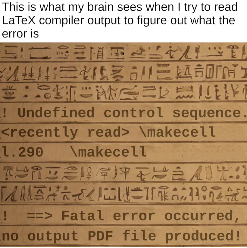
Context: LaTeX is a typesetting system. When compiling a document, a lot of really in-depth debugging information is printed, which can be borderline incomprehensible to anyone but LaTeX experts. It can also be a visual hindrance when looking for important information like errors.
BTW I wrote my thesis in LibreOffice. That’s its own can of worms, but at least I knew how to wrestle it into submission – other than LaTeX. Set the font to Latin Modern Roman and no-one will know the difference.
LaTeX writes the same fonts better, at least compared to MS Office. I notice it when a papers been written in word with the Journal template with the same fonts and style. LaTeX kerns and splits new lines nicer.
I am curious just how many people would notice that (or the usage of the microtype package vs without).
I know of one professor in my college who dabbled in typography and was usually spot on when it came to something like this but I’ve never heard the others talk about it.
In my research group we could tell instantly and it would usually act as a mark against the paper (ie read this one later).
If you’re reading a lot of papers it becomes apparent.