
15·
8 days agoOn my system, it supposedly hasn’t been modified since 2022, and hasn’t been accessed since January. ~/.config/kdeglobals was modified today. You could just rename it to kdeglobals.bak and see what happens.
they/them
On my system, it supposedly hasn’t been modified since 2022, and hasn’t been accessed since January. ~/.config/kdeglobals was modified today. You could just rename it to kdeglobals.bak and see what happens.

Onlyoffice runs in a browser: https://www.onlyoffice.com/presentation-editor.aspx

Nexus 5X still going strong!
(though it did need some hacking to keep it alive)

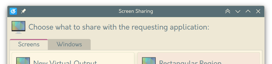
Sadly KDE is also trying out the “modern” style tabs in some places too:
Right, that makes sense as well. What I was thinking is that the use of the accent colour shows which one is active, though it would probably be less confusing if this wasn’t done with an outline. See the KDE version for example:
Regarding keyboard navigation, I could see this working similarly to radio buttons, where the tab key selects the entire tab group, and tabs need to be navigated using the arrow keys. In this case I think it makes sense to put the focus border around only the selected option, and having the focus border follow the selected option when arrow keys are used. If this is the case, I think swapping the current version does make sense.
If they did the exact opposite of this, I think it would look ok. If I was trying to fix this, I would probably just swap the styles of the selected and deselected states. Maybe it’s a miscommunication between designers and implementers, causing the meanings to be swapped?
I believe if you attach more than 4 images to a post, other mastodon servers will only show the first 4 images, and will not give any indication that the remaining images are missing.
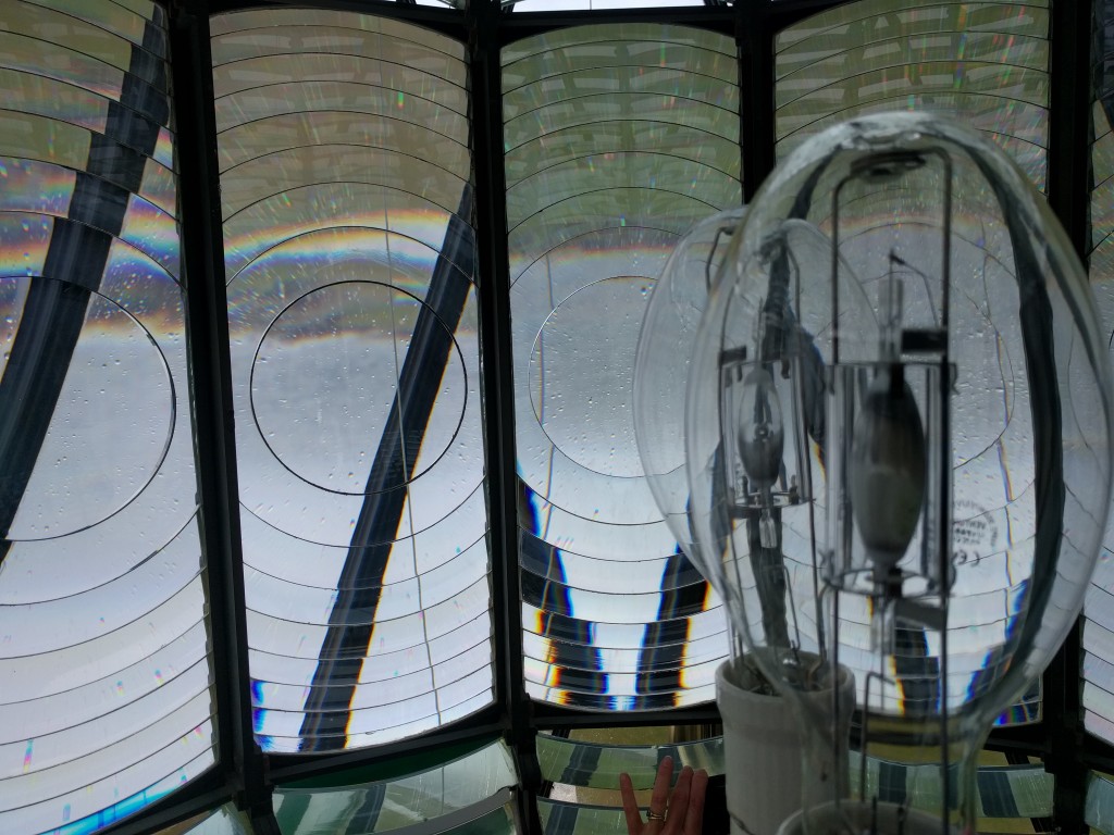
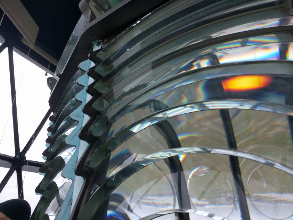
Well… I’ve tried to find out just now. Most taller lighthouses are on small rocks in the sea. On some the lighthouse covers the entire rock. I have also discovered that there are potentially taller land-based lighthouses in the uk, this one just seems to be best at advertising it.

What’s wrong with forms?
Inside the fresnel lens of a lighthouse. (The tallest land-based lighthouse in the UK)
I use LeechBlock NG. It has many different blocking options, including greyscale, or a countdown before the page loads.
You can use command line arguments for minetest to bypass the built in menu. You could then re-implement all menu features yourself.
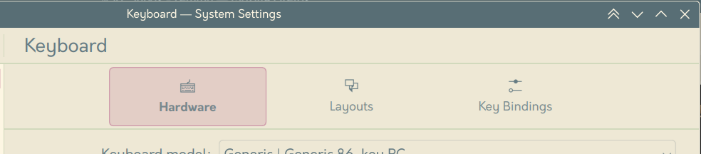
It’s gradually getting there. The settings redesign was introduced a few versions ago, and the online content menu redesign will hopefully land in the next version (and potentially replace the current content tab after that). I agree that the main menu redesign might be a while away though.
I believe it is the implementation of the tick system in Mesecons (which VoxeLibre redstone is based on) that is the issue, and I agree it makes it nearly useless. It is absolutely an issue with the mod, not the engine, but would probably require a big rewrite of the mod to fix (not that I’m familiar with the actual implementation of mesecons).
Transcription:
A Venn diagram with the caption “Nothing to see here, folks, just a very normal venn diagram”.
I think they are complaining about the caption in the image.
Oh, that explains why ctrl is blue.
I’m assuming blue means a key is more used, so it’s showing Caps never gets used. enter doesn’t make sense though, so maybe it’s only showing key combinations?
From my experience, the large button does the flush, but the size of the flush depends on how far you push it down. The small one simply pulls the large flush button down with it, but stops it from going more than half-way, resulting in a smaller flush.


trefle.io has data from various sources, though a lot of pages are rather empty.