Wordle 1,231 3/6
⬛🟩⬛🟨🟨
⬛🟩🟨🟨⬛
🟩🟩🟩🟩🟩
Took me a bit of time to think it through - I got lucky and had four letters in the first 2 turns but struggled to put them all together with a fifth.
Wordle 1,231 3/6
⬛🟩⬛🟨🟨
⬛🟩🟨🟨⬛
🟩🟩🟩🟩🟩
Took me a bit of time to think it through - I got lucky and had four letters in the first 2 turns but struggled to put them all together with a fifth.


Ya, that one isn’t quite clearly labeled. The rest of the charts and data points make sense. Since it looks like this is a 5 day forecast I am guessing that the shaded green area is the historical average high/low temperatures for that date/time wherever this is in the world. The forecast is saying that the temp is expected to be 49°F on 11/1 at 2:07pm which is 9°F lower than the historical average so there looks like there will be a lesser chance of spotting deer according to the top graph. I guess? It would help to see the source page for context/additional info.
Strands #242
“Trick or treat!”
🔵🔵🟡🔵
🔵🔵🔵🔵
Strands #242
“Trick or treat!”
🔵🔵🟡🔵
🔵🔵🔵🔵
Ya, I got this one very quickly also. I think it was more straightforward /easier than many of the other ones lately.
Wordle 1,230 4/6
⬛⬛⬛⬛⬛
🟨⬛🟨⬛⬛
⬛🟨🟨🟨🟩
🟩🟩🟩🟩🟩
Wordle 1,229 5/6
⬛🟩⬛⬛⬛
⬛⬛⬛⬛⬛
⬛🟩⬛🟩🟨
🟨🟩🟨🟩⬛
🟩🟩🟩🟩🟩


I think a lot of people are confusing the “best by” or “sell by” etc. dates on foods (in the USA anyway) with an “expiration” date. The only foods in the US that actually have expiration dates are infant formula. NO foods expire exactly on some arbitrary date stamped on the packaging. The dates are listed to give consumers an idea of when they should think about consuming the product, many with a large amount of useable time after the date printed.
Don’t believe me? Here is the USDA’s FSIS explanation of their own regulations.
Wordle 1,228 3/6
⬛⬛🟨⬛⬛
⬛⬛⬛🟨⬛
🟩🟩🟩🟩🟩
Wow - probably my best solution for this game yet!
Flipple 4 #149 ⬇️
🟩⬜⬜⬜
🟩🟩⬜⬜
🟩🟩🟩⬜
🟩🟩🟩🟩
flipple.clevergoat.com 🐐


Specifically: Califia Farms Toasted Coconut - Coconut Almondmilk Blend. This is the closest I have found since I started watching my carbs/sugar intake 4 years ago.
Wordle 1,215 4/6
⬛⬛⬛⬛🟩
⬛⬛🟩🟩🟩
⬛⬛🟩🟩🟩
🟩🟩🟩🟩🟩


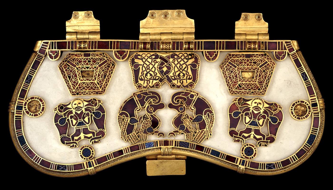
More proof of ancient aliens! However, I never expected them to be mongoose. Or is that mongeese? Mongooses? Lets just go with alien otters.
Wordle 1,207 5/6
⬛⬛⬛⬛⬛
⬛🟨🟨🟨⬛
⬛⬛🟩🟨🟩
⬛🟩🟩🟩🟩
🟩🟩🟩🟩🟩
Wordle 1,206 4/6
⬛⬛⬛⬛⬛
⬛🟨⬛🟨⬛
⬛🟩🟩🟩⬛
🟩🟩🟩🟩🟩
Wordle 1,202 4/6
⬛⬛🟨⬛🟩
⬛🟨⬛⬛⬛
⬛🟩⬛🟩🟩
🟩🟩🟩🟩🟩
Wordle 1,197 4/6
⬛⬛⬛⬛🟨
⬛🟩🟨⬛⬛
⬛🟩🟩🟩🟩
🟩🟩🟩🟩🟩
Wordle 1,195 3/6
⬛⬛⬛⬛⬛
🟨⬛⬛🟨🟨
🟩🟩🟩🟩🟩
Wordle 1,193 4/6
⬛🟨⬛⬛⬛
⬛⬛🟨⬛🟨
⬛🟩🟩⬛🟨
🟩🟩🟩🟩🟩
Lol - ya, location makes a difference. I am now also curious what that is supposed to represent. I looked on their website but since I don’t have an account all I could see was mostly marketing and sales info. There was a FAQ about that feature with a youtube video that might explain the data points but the video opened with a 2.5 minute ad so I bailed… can’t believe there are 3rd party adds on a video from a company’s help section! The iOS app store lists the rut map/forecast as a feature but that’s it. The app does look pretty sweet though - I’ll have to tell my brother about it.