

Hi,
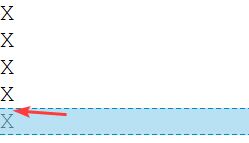
No matter what I try
<style>
.FlexColumn {display: flex;flex-flow: column nowrap }
</style>

<div class="FlexColumn">
	<div>X</div>
	<div>X</div>
	<div>X</div>
	<div>X</div>
	<div>X</div>
</div>
<!-- I tried many CSS trick here... -->
<div>
   <span>X</span><br><span>X</span><br><span>X</span><br><span>X</span>
</div>
I always get a vertical gap between the characters !
Any ideas ?
Thanks.
Your issue is not with css, it’s with typographical https://en.wikipedia.org/wiki/Leading. You can get rid of that gap with negative margin or with line-height and but it would reduce readability.
It might look okayish with your example with just letters ‘X’, but if you try it with any diacritic letters (like https://en.wikipedia.org/wiki/%C3%84) , the lines would overlap and the text would be unreadable.
👆 Sometimes the best solution is to just let it be. It’s better to adapt your design to fit the technology, than it is to fit the technology to your design.