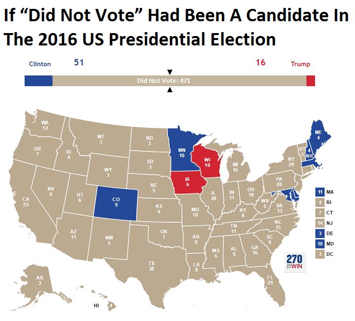
I’m not an American so I’m not sure I understand. Wikipedia says voter turnout in 2016 was 59.2% of the voting-eligible population. Even if we count is a percentage of the voting-age population (i.e. including people with felonies or without citizenship or barred from voting for other reasons) it’s still 54.8% voter turnout.
But that bar at the top of the graph makes it look like only around 15% voted.
It’s cause by FPTP. If the largest share of voters in a given state were people that didn’t vote, all the electoral college votes should go to “did not vote.” That doesn’t happen IRL because they just ignore low voter turnout.
It’s true but for the broader picture one should add that many people don’t bother to vote if their state is predicted to be a landslide victory for either candidate.

I’m not an American so I’m not sure I understand. Wikipedia says voter turnout in 2016 was 59.2% of the voting-eligible population. Even if we count is a percentage of the voting-age population (i.e. including people with felonies or without citizenship or barred from voting for other reasons) it’s still 54.8% voter turnout.
But that bar at the top of the graph makes it look like only around 15% voted.
Can someone explain?
Does the top graph not just show that all the gray states had people that did not vote be the largest percentage.
So if for example 30% voted for Biden and 31% for Trump, you still have 39% that did not vote thus making the non voter ‘candidate’ win.
In this case the voter turnout is 61% yet the non voters represent the biggest share.
It’s cause by FPTP. If the largest share of voters in a given state were people that didn’t vote, all the electoral college votes should go to “did not vote.” That doesn’t happen IRL because they just ignore low voter turnout.
It’s true but for the broader picture one should add that many people don’t bother to vote if their state is predicted to be a landslide victory for either candidate.
40.6% is bigger than half of 59.2%
deleted by creator