

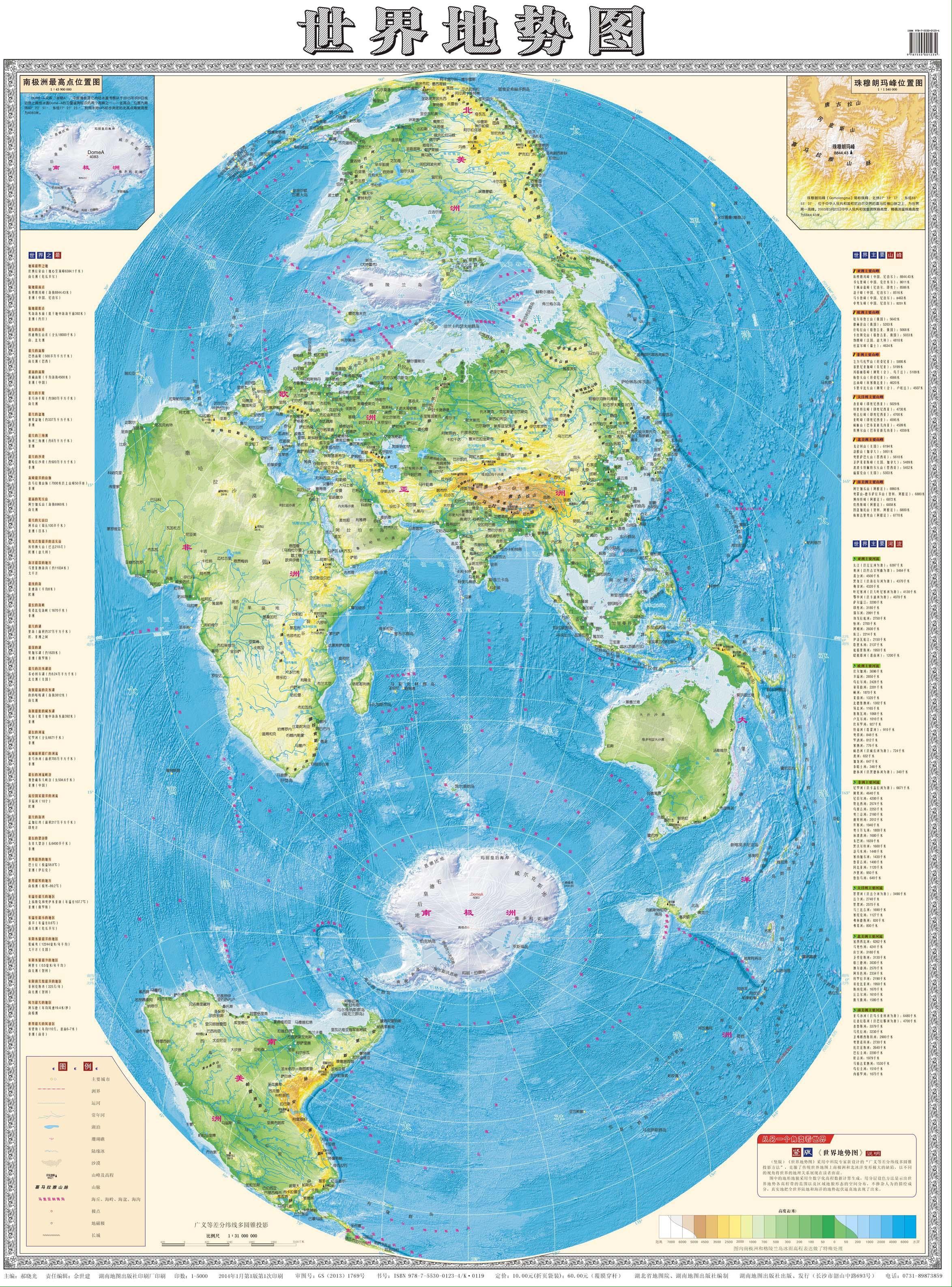
Seems like it’s very specifically chosen to preserve distances and reduce distortion along the longitude lines closest to China. Perhaps it is useful in that capacity but it introduces distortion for the entire rest of the world.
I guess it really puts the 中 in 中国 (中 means middle, 中国 means “middle country” and is the Chinese name of China)
It’s fascinating to see a Mercator-style projection that does not produce a huge Greenland.
Maps like these must all have been frustrating to plot out before the advent of non-Euclidean geometry explained a bit better what was going on with the numbers, certain forks in the mathematical road taking you where things didn’t quite make sense, and there was nothing you could do about it, except start over from a different point and or geometrical approach.
How is this a “Mercator-style projection”?
Also, people figured out the Earth was round long ago exactly because of these sorts of discrepancies. There just wasn’t a lot of value in being hyper accurate since the purpose of a map before the invention of ocean ships was just walking from one city to another along roads.
there was a whole hell of a or more to maps than “waking along roads”. in fact, that was pretty much never a usage before cars. back then you walked roads you knew, roads with signs, or asked locals which turns to take. no one back then would take the time to make a map of their own town unless they were in a major city with many foreign travelers. remember, before the car 99% of people never left the town they were born in, and if they did they didn’t go far. everyone knew their own area and the people in it. if someone saw a parson they didn’t know that was often unusual and worthy of fear or suspicion.
maps were for unconquered lands. maps showed coasts and cliffs and forests. maps showed ports and currents and climates. they showed enemy positions they showed friendly taverns they showed where you weren’t welcomed.
maps are not useful when vague beyond sating curiosity. an imprecise map was the result of many many deaths at sea. a ship’s pilot back in the day (the navigator, kind of) would have a trove of maps and journals he inherited from The one he apprenticed under. some of those journals were the most valuable books in all human history. they created all international trade for centuries. these were basically very very long detailed turn by turn directions to get from Port to Port. like “depart from malaga Port heading 12.3 degrees west. there’s a warm current for miles north of there during the months of summer. avoid it.” things like that. they didn’t necessarily get all that caught up by the whole roundness thing. they did it all by hands measuring distance and direction. what they struggled with was the accurate keeping of time to use the sun and stars to determine angle and latitude. the curvature of the earth is really only a massive problem in making world maps. even a map of all of China is barely affected by the curvature. world maps have always been vague because they’re zoomed out too far to make out important details.
That was a fun read
I guess I mean the type of map that we grew up seeing in our schoolbooks and encyclopedias, the type that distorts the further you get from your starting point, but instead of putting Europe at the center of things, this map here starts from Asia, outwards.
EDIT: as such, it represents the Indian Ocean and South China Sea, Sea Of Japan coastlines more accurately (as would be seen from space), while the Mercator does it for the Mediterranean and middle Atlantic.
All projections of a sphere onto a flat plane introduce distortion. But there are lots of different projections though.
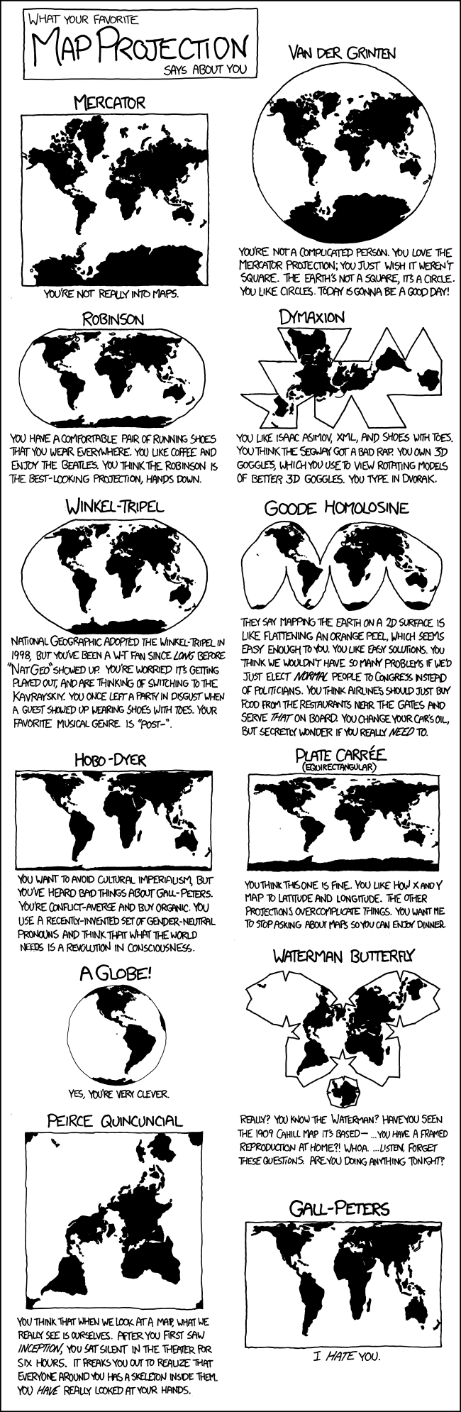
See this relevant XKCD:
The way I understand it, when you plot out the topologies of spacetime via Relativity, the same kind of thing can happen, the maths gets all weird and funky on you, can blow up into infinities at certain points, and we call them singularities.
It still kinda blows my mind that these things popped up in the math first (by Karl Schwarzschild in the trenches of WWI, 1915) and it wasn’t until exactly half a century later their existence was physically detected for the first time (Cygnus X-1, in 1965).
Then you use a different mathematical tool to plot out spacetime, and you get white holes, Einstein-Rosen bridges and parallel universes.
Different maths for 3D (or 4D) topological maps of spacetime show us different phenomena, and that relevant XKCD serves as a perfect analogy of how many ways there can be of approaching the same topologies.Or why the hell not try mapping things out in ten dimensions! Come up with M-theory for a multiverse!
Einstein-Rosen bridges
just say wormholes you NERD
I’d ask for some of whatever you’re smoking that makes you say all of this in response to a map, but I need to be able to drive a car today and I don’t want a DUI.
What makes you think I smoked anything?
Why couldn’t it be… edibles? :-P
And don’t get me started on the topologies and symmetries of fields in quantum mechanics!But seriously, I enjoy letting the mind take me for a nice long ride, using an artifact to trace connections to other things throughout history, and in this case it’s the math of maps, their topologies.
Random topics on Lemmy sometimes lighting up my mind like a Christmas tree.Also trying a little to get into the mindset of the era when some of these things were being cooked up and explored, shift perspective as best I can, from where and when I am. It’s incomplete, but it’s still fun. I probably got this type of “pinball narrative” from James Burke and his old history shows Connections and The Day The Earth Changed.
Black holes are actual singularities (by existing physics), though, not mere coordinate singularities like the poles. Coordinate singularities show up in GR too, but you can get rid of them by changing your coordinate system - a very common operation, apparently.
You’re right the math is similar; you can learn a lot of differential geometry concepts just by looking at coordinates of, or projections onto a sphere. Curvature gets exponentially more complex as you step into 3 and then 4 dimensions, but the same mathematical objects apply.
(Interestingly, differential geometry in dimensions 5 and up is the same as in 4, and topology actually gets easier)
you can get rid of them by changing your coordinate system - a very common operation
Would that be the Lorenz Transformations?
I believe you’re correct, though it’s a transverse Mercator
Also, people figured out the Earth was round long ago exactly because of these sorts of discrepancies.
Sure, they had an understanding of how the thing warped, they could see with their own eyes that their flat math was kinda rubbery with curved surfaces, but they hadn’t separated the two realms of geometry, hadn’t figured out that you could have a triangle where the angles didn’t add up to 180°.
It must have been very strange and disturbing to see math as imperfect, incomplete or mischievous in some way. Wasn’t this the language of God? Therefore, shouldn’t his language be perfect?
While this might be going on in your mapmaking mind, the king or emperor, the generals and admirals, and the religious authorities are looking closely at these maps, and here you are making something that has a hazy sense of sacrilege.
This projection heavily distorts areas where it is not so obvious, as they are in the middle of the Atlantic and Pacific ocean, but also parts of Africa.
It’s annoying when English names of countries are significantly different than what the countries call themselves. Besides China = Zhongguo, off the top of my head there’s Japan = Nippon and Germany = Deutschland.
It’s a thing in all languages, because not every language has all the sounds of every other language.
For example, in Chinese, Canada is Jianada, America is Meiguo, Brazil is Baxi, England is Yingguo.
My understanding is that Japan has a similar story as the European explorers who first made contact there were Portuguese and couldn’t pronounce Nippon correctly.
Having a name that is an approximation of the native one is perfectly understandable, which it looks like all the Chinese examples are, but none of the ones I listed are at all. Zongo is probably how China would be transliterated in English, and Nippon and Dutchland are easy to say. of course, English has that problem of calling other people Dutch causing an issue with that last one. Sticking to the names that Portuguese explorers gave is where a lot of the weird English ones come from.
Zongo is probably how China would be transliterated in English,
Zh is a J sound. It would be more like Jong Go
Ah, yeah, that sounds better.
Nonetheless, there are examples of other languages besides English messing up the name of another country. Practically no two languages call Germany or The Netherlands the same thing, and almost none call them what they call themselves. I’m not making a value judgement about this phenomenon, just saying that it’s not unique to English.
For another example, Japan’s name comes from the Chinese word spelled with the same characters, but it’s pronounced completely differently in Chinese.
Oh, sure, other languages do the same. It’s annoying when anyone does it!
https://feddit.org/comment/1079443
TY for highlighting the advantages of that projection.
Perhaps it is useful in that capacity but it introduces distortion for the entire rest of the world.
It’s China. Of course it does.
Looks quite similar to a Cassini projection with the 75° E meridian as centre instead of the 0° meridian.
Indeed, thanks!
but why tf is the equator not in the center
This is also the first portrait map I’ve seen, too. Really novel design choices here (why centre just south of India?)
The equator is one centre axis, one meridian, here 75° E the other. Thus, 0° N 75° E is the centre here instead of 0° N 0° E.
Seems like this map accurately displays the poles at the expense of the continents
Slicing the Americas in half is brutal, took me a minute to figure that out
When I was a kid, a lot of US maps where US-centered. They would chop Eurasia down the middle and include some overlap on the edges (so places like India might show up twice).
I’m still trying to figure out how you would assign directions on this map.
Like which way is “North”?
Interesting, not a projection that I have seen before.
I’ve never seen a sinocentric modern map before. Weird that they decided to go with portrait mode.
Arguable. It’s more Pacific-central instead of the usual Atlantic-central.
That’s what every map looked like when I lived in Korea. Took me a while to get used to.
The one posted by OP really took me a minute to wrap my head around.
It’s not really sino-centered though. It’s indian ocean centered at best. As another user pointed out, it says it exists to see the world from a different perspective. It’s not to be useful, only to show how things can look so much different with different perspectives.
How else to fit both poles so close to the middle
'Cos it was the only way they could slice the americas the way many western maps slice asia
I feel the blood rushing to my head
The box in the bottom right corner literally says “see the world from a different perspective”.
从另一个角度看世界
(cóng lìng yīgè jiǎodù kàn shìjiè)The quality isn’t quite good enough for me to see the rest but they are highlighting the different projection.
It is quite funny to see the US and the Americas generally kinda cast to the side in this map.
While it’s obviously putting China and Asia in the middle (actually looks like India is right in the middle) … as far as making certain areas look bigger or smaller than actually are, compared to the standard mercator style projections … Russia and Greenland seem to be the “losers” here while Africa looks relatively huge.
Africa is huge- many people underestimate it, although in this case it is a bit too large compared to India in the middle. Also the colorscale makes Sahara and other low desert areas too green - the habitable part is not so great.
I can’t read Chinese, but looks like the colors represent elevation, not how green an area is.
Africa is huge
Oh I know … I noted it as a positive of the map … probably makes Africa feel appropriately big compared to the rest of the world.
It is quite funny to see the US and the Americas generally kinda cast to the side in this map.
both are “generally” cast to the side. London is primal
Americas are cast to the side of the map. They center on Europe.
India actually, as no way Spain is ~1/3 of India in reality. They probably take advantage of the area of China being subtly enlarged.
I meant on regular maps, americas are to the side too.
Seems to make Antarctica look a lot smaller than it is too.
The way the map is layed out definitely makes it the hardest map I’ve ever tried to understand.
this is gorgeous thank you so much for sharing it. so interesting. terrible projection for many reasons of course but fascinating for so many more
I love the one that shows Japan at the top very heavenly looking, and then the British Isles at the very bottom looking like the savage end of the world
Having been to both places… Yeah I understand.
Cries in anjin
deleted by creator
Panama can go soak, I guess…
Dem great lakes tho
Good old “Zhonghua”.
Xianghua is a top 3 Soul Calibur character fosho
In case anyone is OOTL, that’s the Chinese word for China, and it can be translated as “middle kingdom” or similar, implying that they are literally in the center of the world.
It’s a way every culture tends to think about themselves, TBF.
It’s 中国 (Zhōngguó).
Ah, my bad. I couldn’t remember it exactly and the Wikipedia article was a bit confusing.
Much like the Mediterranean.
That’s probably 香花 (xiāng huā), “fragrant blossom”. Fitting name, she smells amazing.
ayo whut


